Holy Family Catholic Church
Brand Appearance
Skills
- Branding
- Email Marketing
- Page Layout
- Photography
- Social Media Management
- Web Design
Programs
- Adobe Illustrator
- Adobe InDesign
- Adobe Photoshop
- Constant Contact
- Wordpress
About This Project
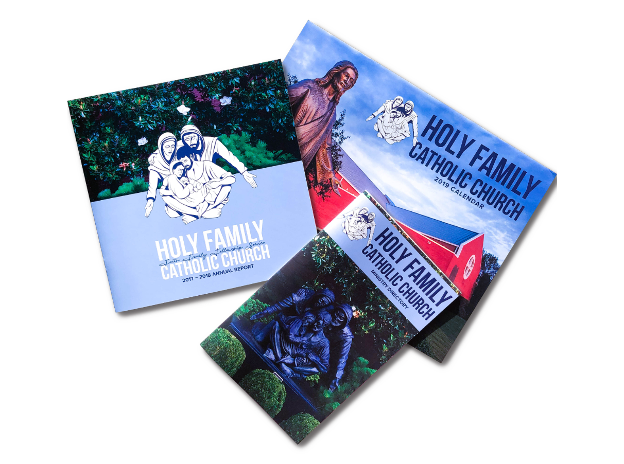
This project showcases a redesign of various brand assets for Holy Family Catholic Church during my position as Communications Director. The goal of the redesigns and overall refresh of their brand was to create a cohesive and modern visual identity that would appeal to both new and current parishioners.
Overall, the refresh of their brand helped Holy Family to communicate their values, mission, and activities to parishioners in a visually-consistent and engaging way.
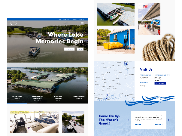
Website
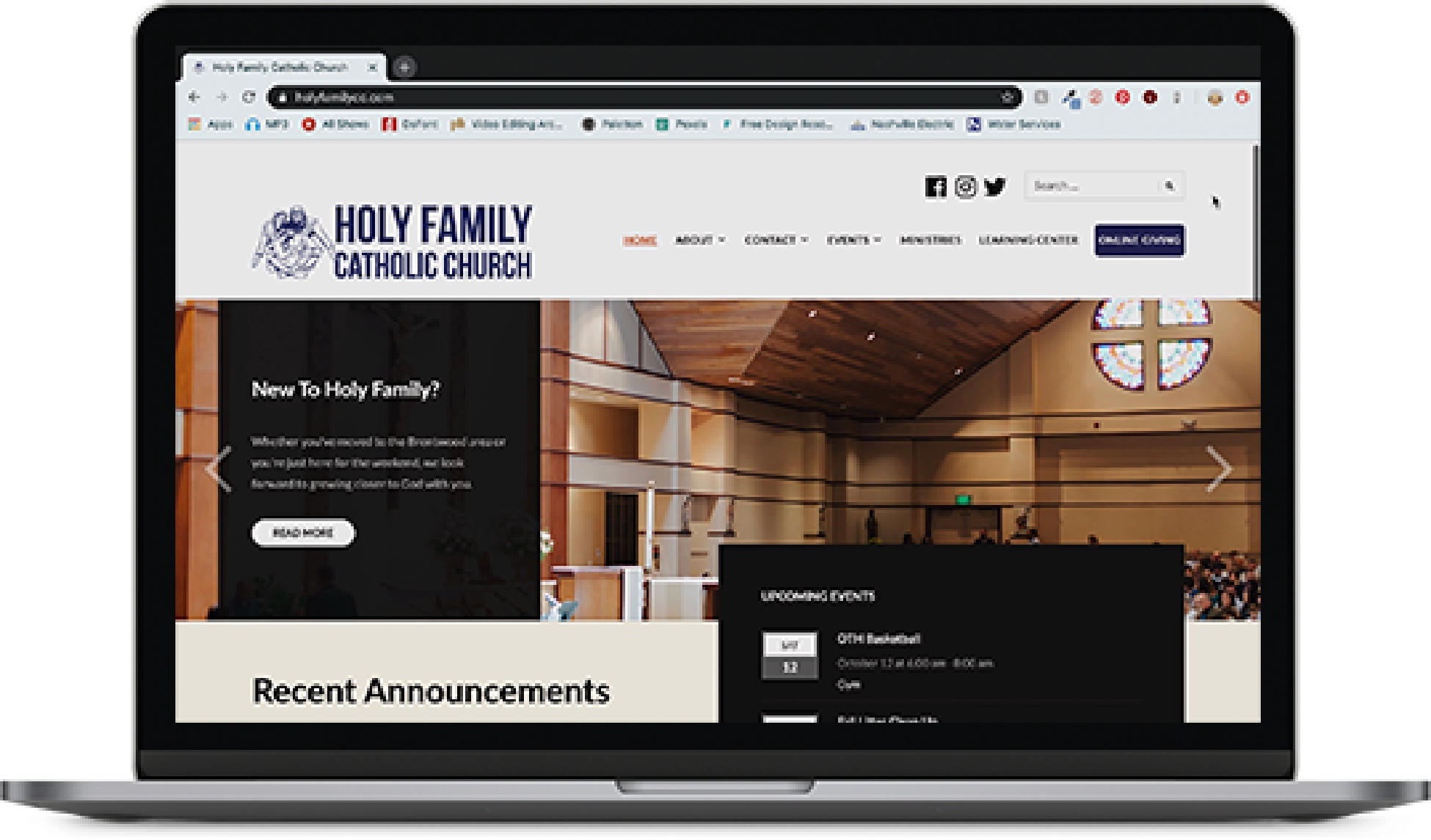
The website was redesigned to have a clean, modern, and user-friendly layout that made it easy for visitors to find the information they needed such as the events calendar, a section for mass times, and volunteer opportunities.
In redesigning their website I moved their the domain over to Wordpress and utilized my skills in HTML and CSS.
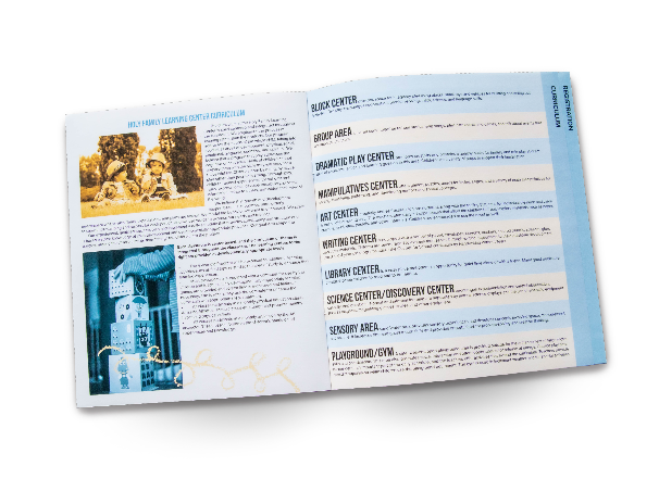
Annual Report
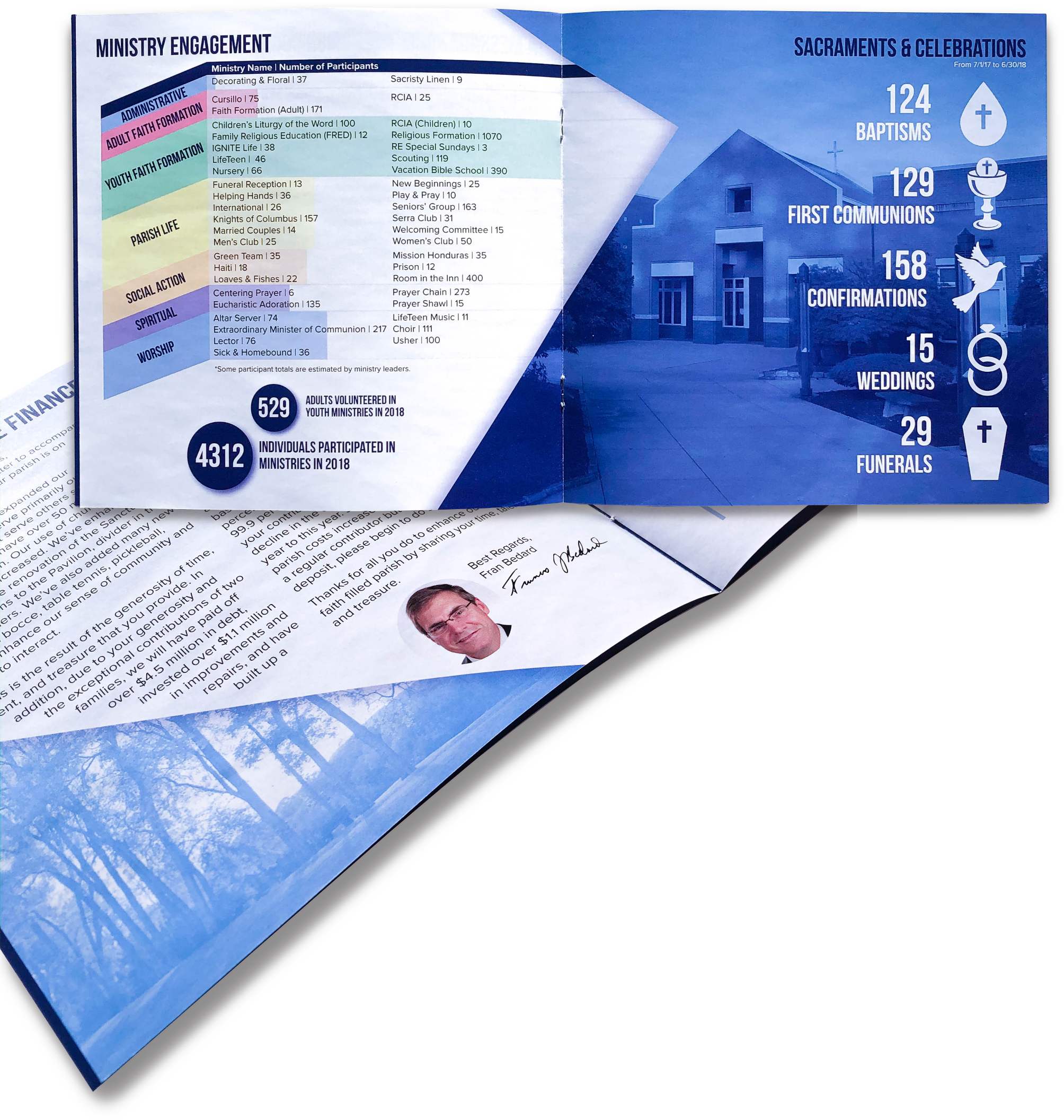
The annual report was designed to be visually engaging and easy to read. The report included financial information, a message from the pastor, and highlights from the previous year. The design used a typography system that was consistent with the website and other assets, and included high-quality images to support the content, all photos of which were shot by me.
Pew Connection Cards
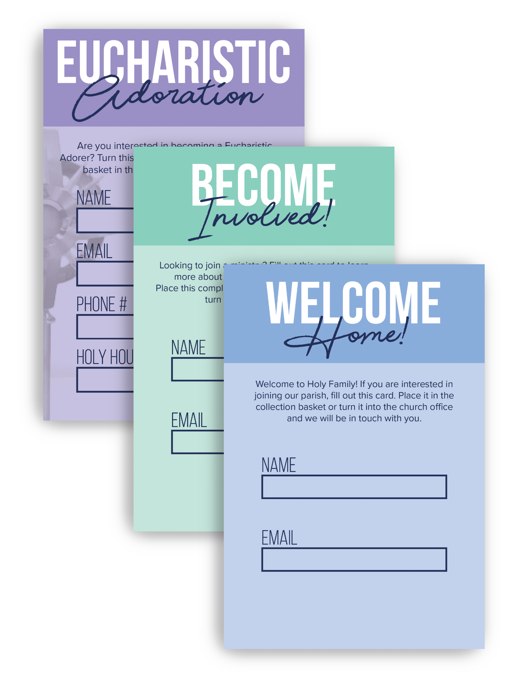
The pew connection cards were redesigned to be visually consistent with the other assets and utilized their newly created secondary color palette to distinguish the different cards from each other. The cards included a section for visitors to fill in their contact information of which upon turning in the cards I would send a templated email correlating to the card that they had turned in.
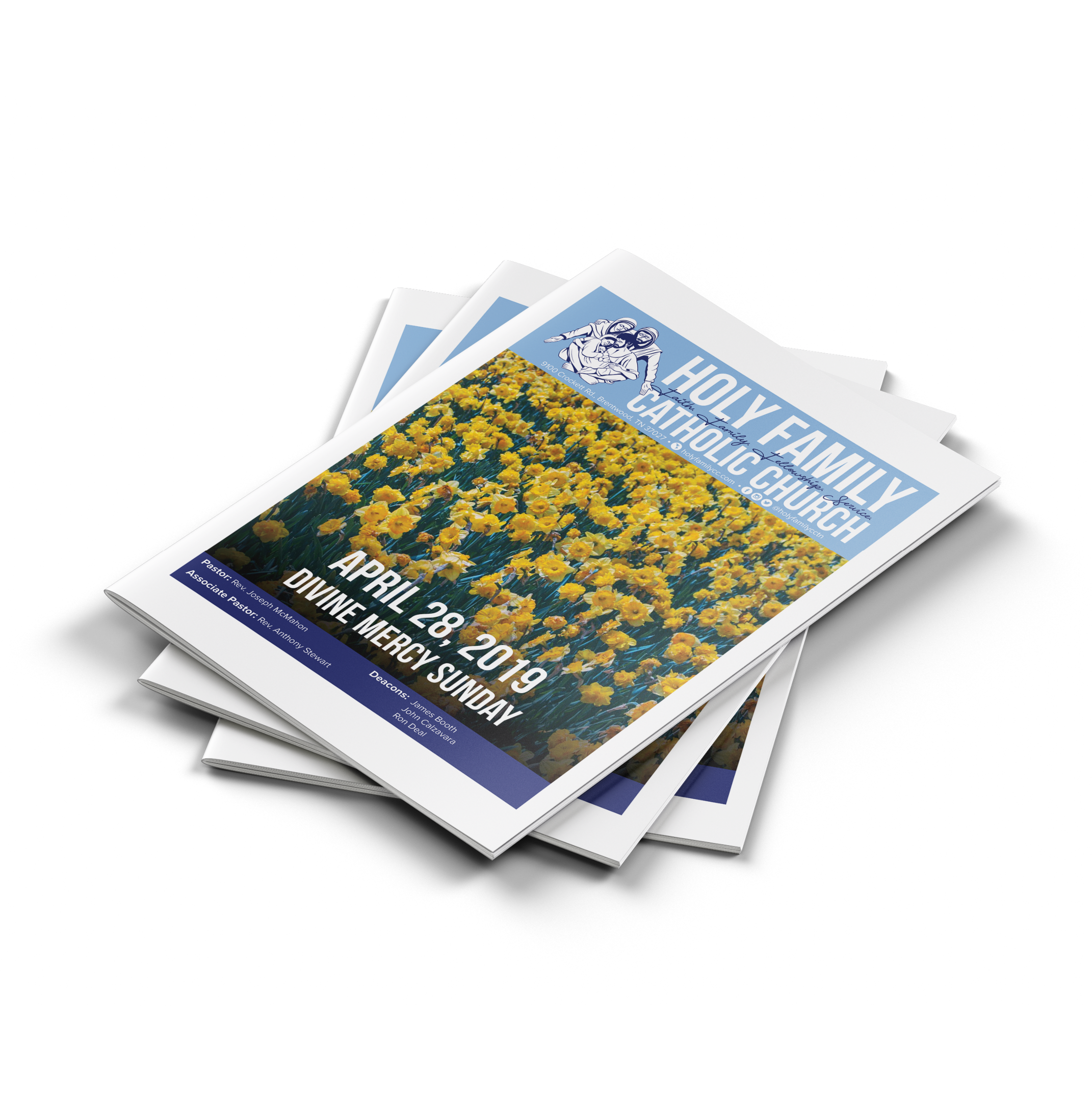
Weekly Bulletin
The weekly bulletin was redesigned to have a consistent layout, making it easy for parishioners to find the information they needed each week. The bulletin included a calendar of events, announcements, and a message from the pastor.
